ROOM RADAR
the physical prototype
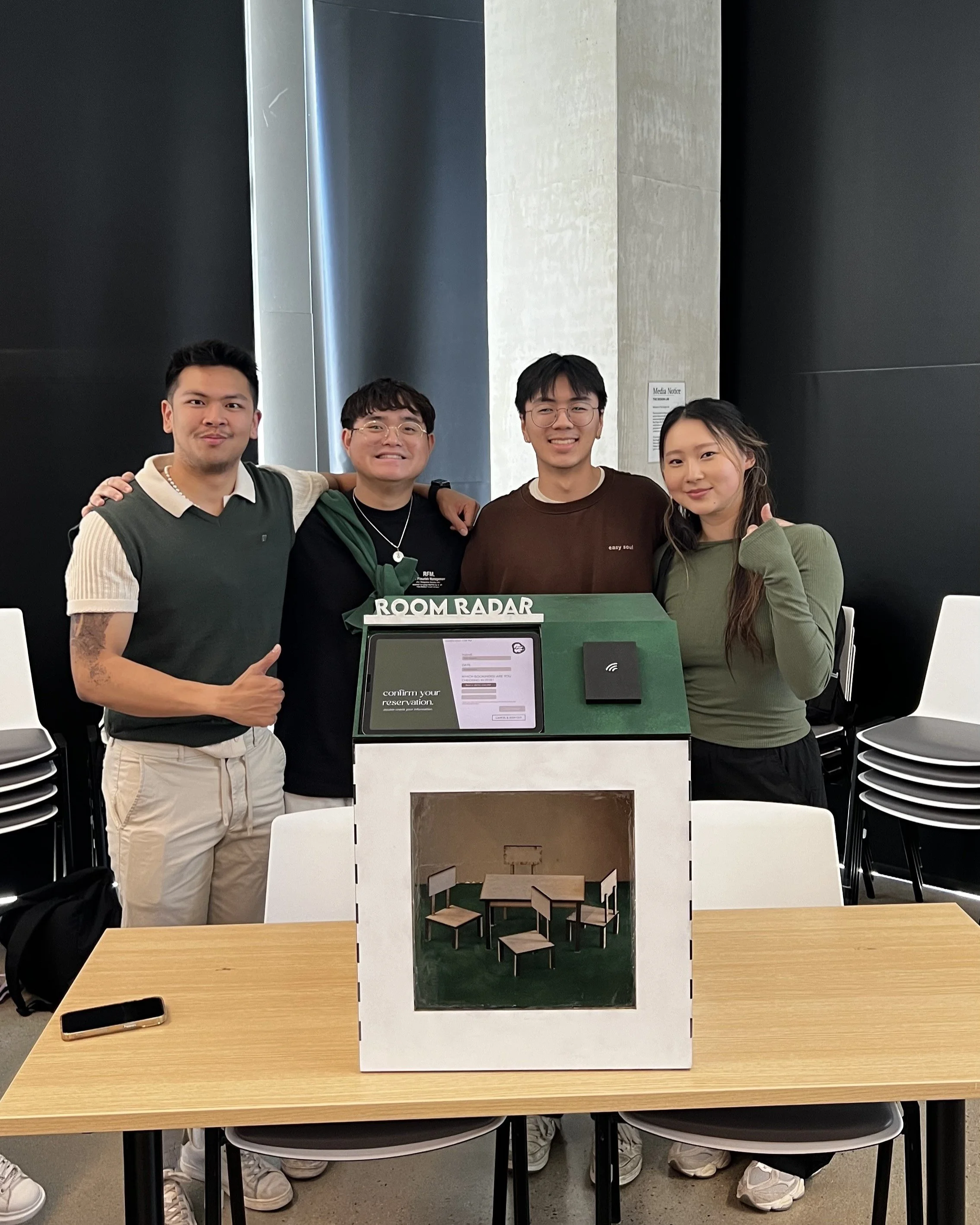
(Above): Me and my team behind our completed physical kiosk with the integrated digital screen.
For the physical portion of our project, we were asked to create a fully realized physical chassis constructed from physical materials that would house the screen with our digital prototype. It was to have at least one physical interaction of a mechanical nature and enough signage to brand the experience for users.
Materials Provided: 1/4” thick plywood sheets, 1/4’ thick acrylic, wood/super glue, spray mount, laser cutter
Physical Constraints:
Prior to the construction of the kiosk, our team members each sketched out 5-10 initial ideas for the physical shape of the kiosk. We then engaged in a collaborative discussion to explore the themes, practicalities, and inspirations behind each design. Ultimately, my sketch (shown in the top right) was selected to begin construction.
Brainstorming

My 7 initial sketches for the physical kiosk ideation. The selected design appears at the top right.
Why My Design?
The selected design clearly displayed the purpose of the kiosk by mimicking an actual study room. The slanted top would be ergonomical for the user to interact with the tablet. Additionally, the simpler shape of the kiosk would be a more reasonable choice to construct within the short amount of time (2 weeks) that we had.
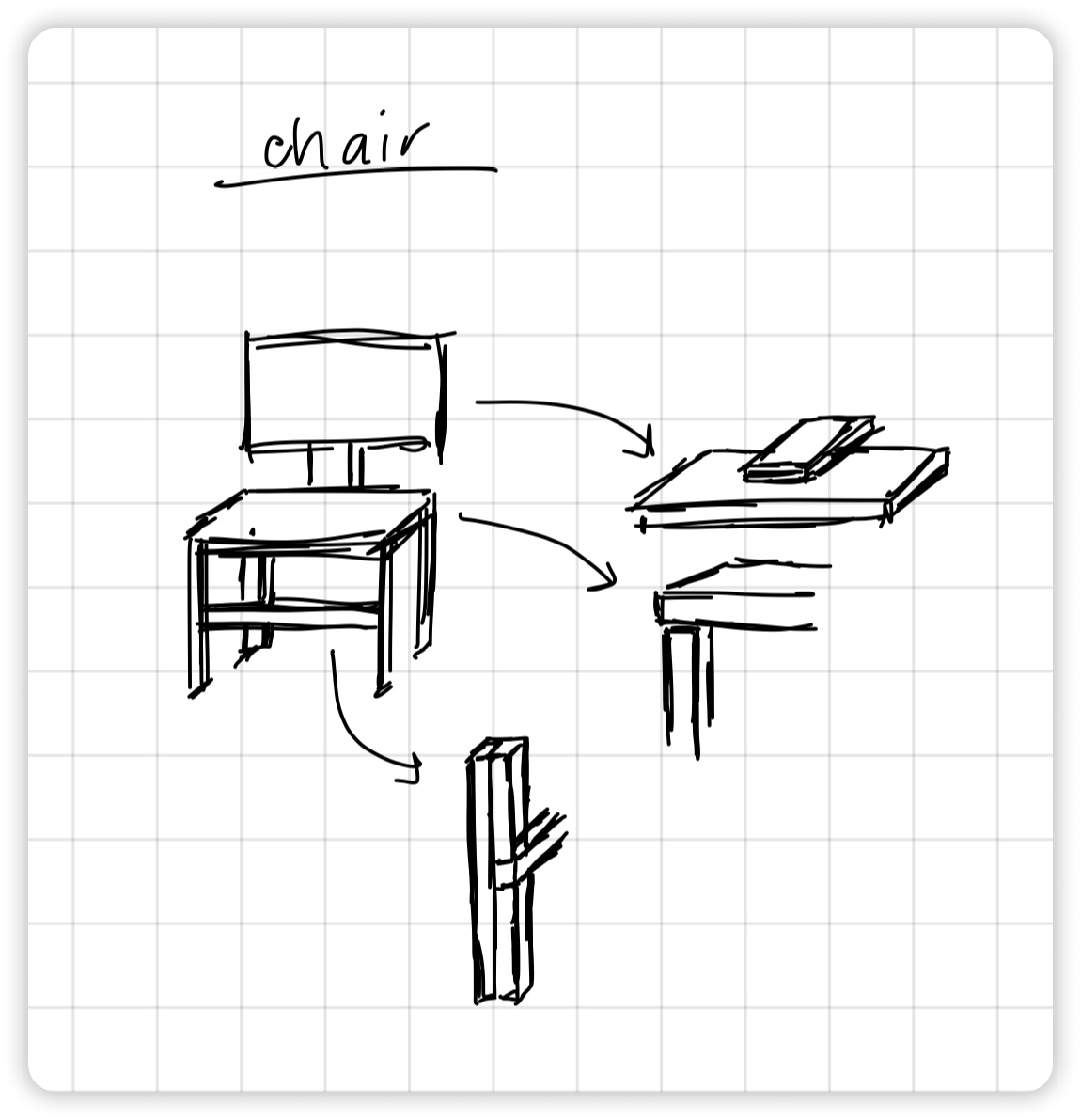
I then made some more detailed sketches outlining how certain parts of the kiosk should be put together. For instance, the chair would be constructed by cutting out the individual wood pieces before gluing them together as shown.
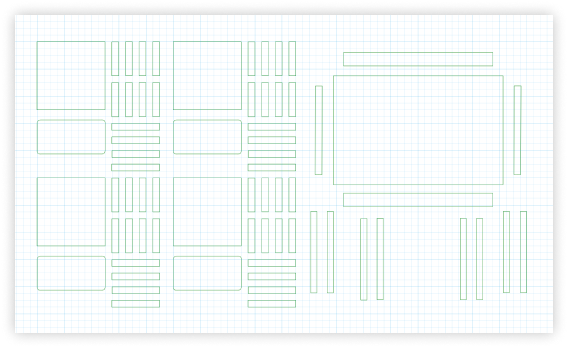
Inkscape
Our class used Inkscape’s software to create the designs to be laser cut into our plywood and acrylic materials. I was put in charge of designing, cutting, and constructing the mini table and chairs to be placed inside of our kiosk. Below are the final Inkscape files with the blueprints of the chair and tables.
The Construction
While my teammates took the lead for the construction, I often came by to provide support and give an extra helping hand.
Here are some key details that I took part in.
To emphasize our brand through the visual design of the kiosk, I suggested the following:
An accent wall with our representative letter, R. I created an Inkscape file with a stencil of R cutouts. This stencil would be placed on top of the appropriate exterior walls of the kiosk and spray painted over.
A cutout sign with our kiosk name, “Room Radar“. The sign would be painted a contrasting color and placed at the top of the kiosk so that users could see it from a distance.
Branding:
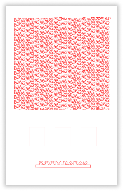
The Inkscape designs for the branding details mentioned: top of this image shows the accent wall stencil, and the bottom of the image shows the Room Radar cutout sign.
We used green spray paint to paint the exterior of our kiosk in order to align with our branding guidelines as much as possible. However, the detailed nature of the stencil made it impossible to ensure every corner was pressed down firmly. It led to leaking beneath the stencil when spray painting and resulted in unclear lines.
In the future, I would either use a heavier and flatter material as a stencil or take the time to tape down all the corners to prevent leaking.
An Area for Improvement:


The Final Kiosk:

Front view of our finished kiosk. The clear acrylic mimics the windows of a study room, giving users a view of the mini table and chair inside. These were left their natural wooden color to align with the brown and green color palette we had decided on.
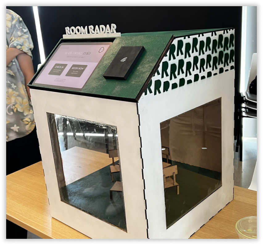
Side view of our finished kiosk. Here you can see the cross-hatch pattern we made at the edges of the walls to make the gluing of the panels sturdier.
You can also see the where the spray paint bled from our stencil, making the green R’s a bit unclear. We decided to keep the R pattern limited to the top half of the kiosk as to not overwhelm the eyes and keep a cleaner appearance.
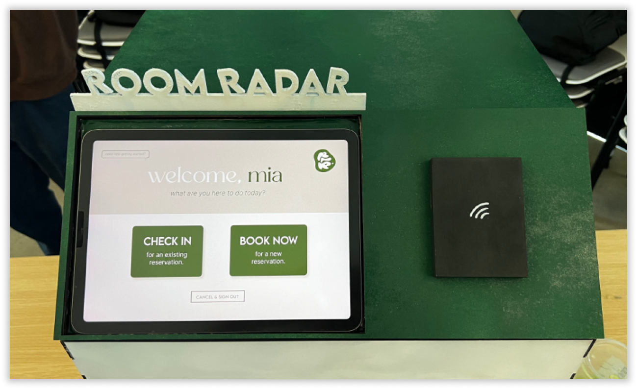
Top view of our finished kiosk. The black box to the side of the screen represents the ID card scanner where students can scan their IDs. The tablet where our digital prototype is displayed rests inside a nook, and the panel is slanted so that users have an ergonomic view of the screen when the kiosk is on the table.
Conclusion:

On March 19, 2024, our DGSN 100 class held a showcase for the teams to display all of our kiosks. While half our team stayed behind to introduce our kiosk to visitors and answer questions, the other half got to walk around the room and see others’ (then we got to rotate tasks).
Here are some key insights:
We were truly impressed by the creativity displayed by other teams, and it was enlightening to hear about different ideation processes. It was particularly intriguing to see how some groups prioritized the mechanical user interactions rather than the digital, highlighting diverse approaches to design within our class.
We recognized the vital role of signage and branding beyond the kiosk itself. Since kiosks are intended to provide services without human supervision, it is crucial to ensure ample exterior indicators are available, enabling users to navigate and utilize the kiosk independently, without needing direct instruction.
We received constructive feedback regarding minor imperfections in the physical construction of our kiosk. Our professor noted glue marks on the clear acrylic windows and uneven spray paint lines. These issues could have been addressed through further iteration if we had more time.