ROOM
RADAR
It’s midterm season at UC San Diego and Geisel Library is at its busiest. You and your friends, needing a quiet place to focus, have found an empty private study room and have just gotten into the zone. All of a sudden, another group of students knocks on the door. “Hey... This is awkward but I think we have this room booked.” You and your friends, startled by the interruption, hurriedly gather your study materials and leave the room. Time to search for a new spot…

Room Radar is a kiosk designed to provide real time information regarding the availability of study rooms in our university library (Geisel Library). These kiosks would be placed at locations within the library, allowing students to have a visual view of what spaces are being used, mitigating conflicting use of these spaces.
Role:
Designer
Team:
4 members total
Timeline:
February 2024 - March 2024
Tools Used:
Figma, UX Research, Prototyping
As a part of our DSGN 100 (Prototyping) course, we were split into teams of four and tasked with creating a physical kiosk with a digital interface that would create an intuitive and valuable interactive experience for users.
As students from diverse majors and backgrounds, our team frequently gathered at the campus library, which served as the starting point for our brainstorming sessions. While working there, we observed a significant issue: students struggled to share the few study rooms available in the library.
Additional online research, field observations, and interviews with library users revealed several primary goals we aimed to address with our kiosk:
Lack of suitable study spaces. Interviewees noted that they spend excessive time searching for suitable locations to study.
Overly competitive online booking system. Participants described the current mobile online booking system as difficult to navigate and requiring reservations months in advance, which discouraged them from attempting to book rooms.
The need for privacy on campus. Many mentioned how a study room would’ve been useful when they needed privacy in between classes to attend meetings or interviews.
Poor allocation of existing study spaces. Despite the apparent demand for these spaces, our observations indicated a notable number of unused rooms due to no-shows.
The Problem
Getting to Know Our Users
Based on the pain points identified from our interviews, I developed a primary user persona to guide our project. Mia Watson, 20 years old, is a busy third year college student. As a commuter student, she navigates a schedule of in person/Zoom classes, club events, and taking breaks whenever she can. She’s particularly frustrated by:
Awkward gaps between in person commitments, leaving her searching for spaces to linger on campus.
The need to book study rooms for Zoom calls and club meetings weeks in advance, and frequent failures to secure these bookings in time.
Our primary user persona graphic, describing Mia Watson’s characteristics, needs, and frustrations.

To address Mia’s pain points, our solution enables users to easily view study room availability, book rooms on demand, and check into their bookings (which ensures that no-show reservations can be reallocated to those in need).
Setting the Mood

Before creating the lo-fi mockups for our project, I curated a moodboard and developed a style guide to establish our brand identity. I aimed to choose colors, fonts, and descriptors that evoke a sense of calm and focus among our users to facilitate our ultimate goal of finding a productive area to study.


I utilized Figma to develop the initial lo-fi digital wireframe for our project. Based on our research and primary user, I created a home screen as well as two primary functionality pipelines: “Check In” and “Book Now”.
The Check In feature enables users to notify the system of their arrival for an existing reservation
The Book Now feature allows users to make a new reservation on the spot.
Lo-fi Prototype

(Above) The default screen to be displayed on the kiosk; the welcome screen; the reservation info screen for existing reservation check-ins
(Above) The confirmation screen after checking in; the floor selection screen for new bookings; the room selection screen for new bookings

(Above) The time slot selection screen for new bookings; the confirmation screen after a new booking is made.
Hi-fi Prototype
Using the low fidelity prototypes as a guide, I developed a more extensive, clickable, high fidelity prototype. Following are a few of the key screens from the prototype:
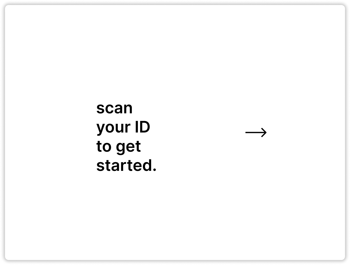
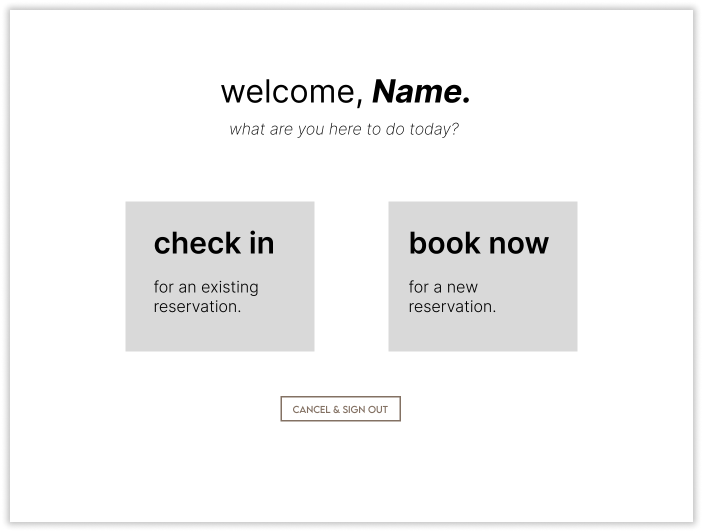
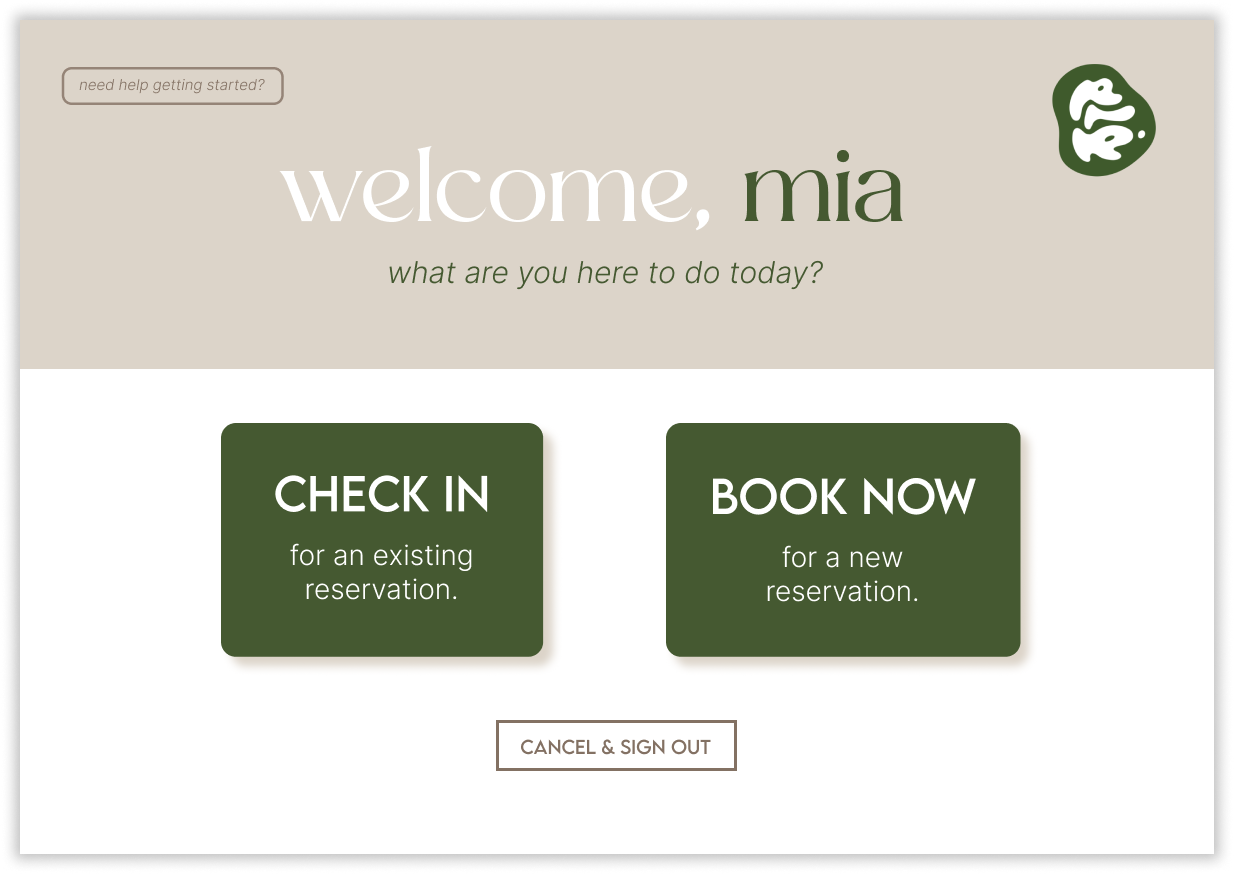
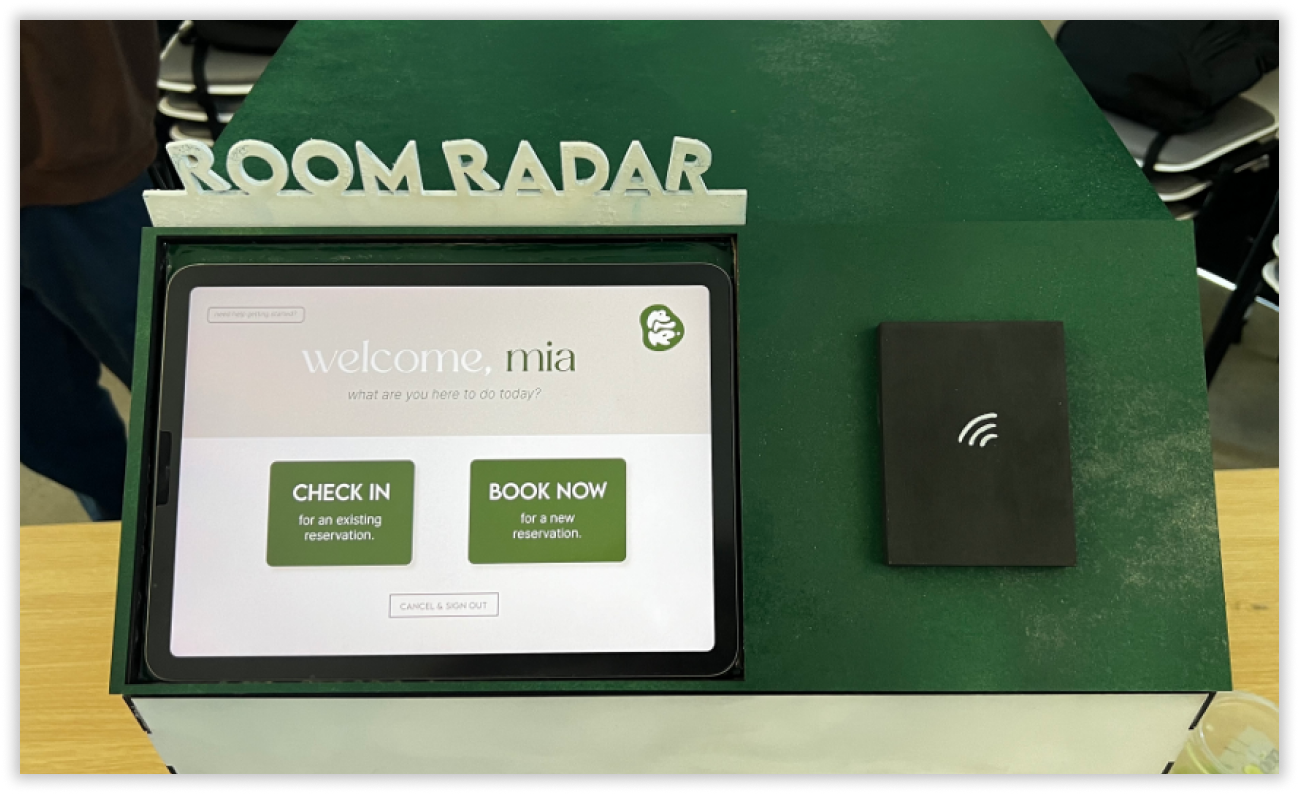
The default page would prompt users to scan their student ID card, which would automatically enter the students’ information into the system, logging them in. The screen would then change to the welcome page, which contains the two options: check in to an existing reservation or book a new reservation.
Default and Welcome Page:

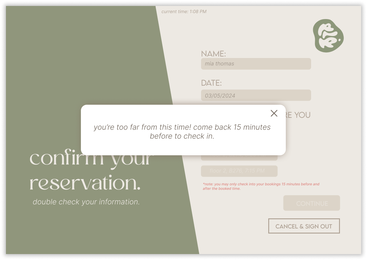
If the user decides to check into an existing reservation, they will arrive at this page, displaying all bookings linked to the user's student account. A distinctive feature of our system is that reservations will be released if not checked into within 15 minutes of the scheduled time, ensuring that unused rooms are made available for students like Mia who may need them right away. Thus, if a user tries to check in early, a pop up notification will ensure that users cannot falsely check into bookings too far away.
Reservation Information:

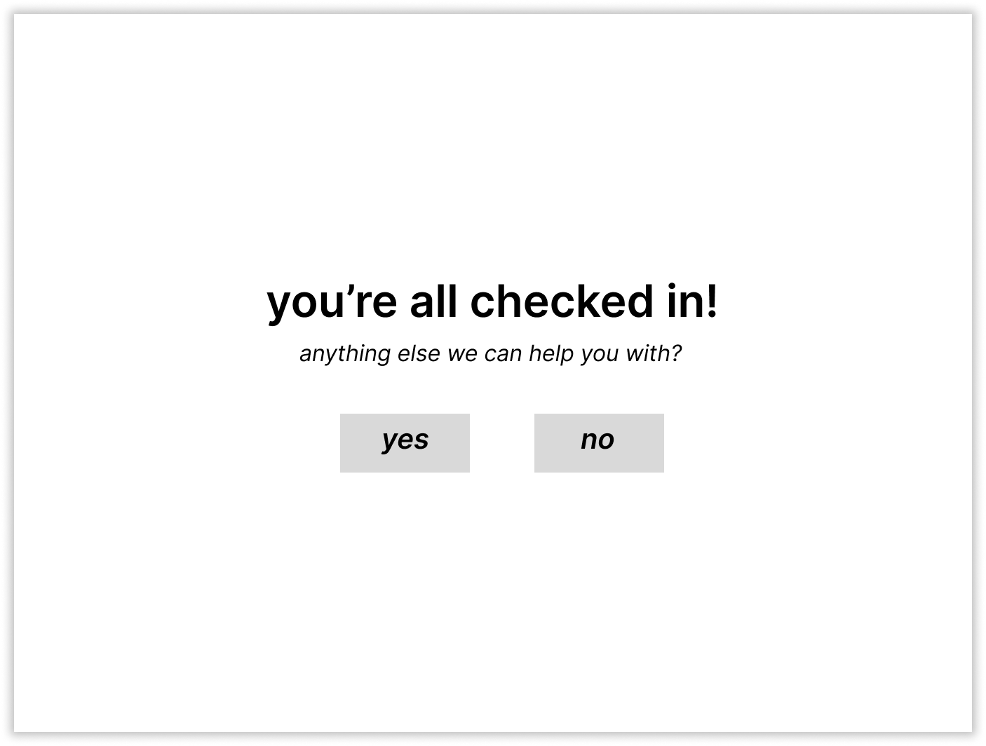
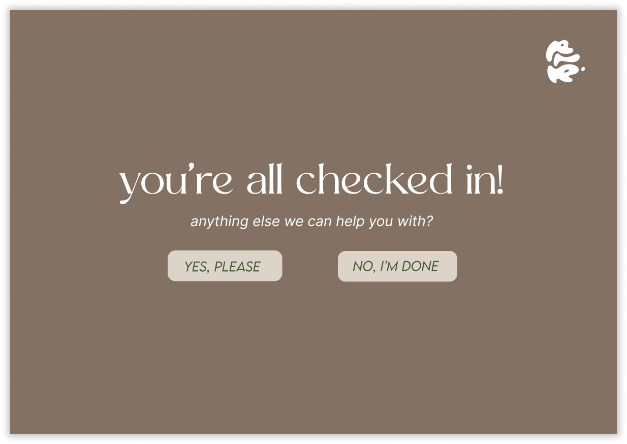
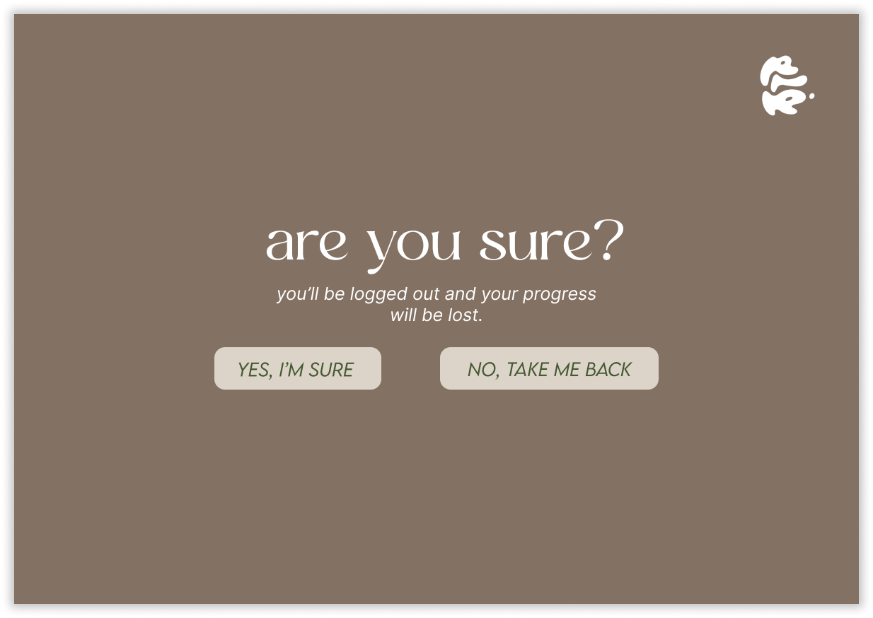
The confirmation page notifies users that the check-in has been successful, and offers the option to return to the home page if another reservation or check-in needs to be completed before logging out. Additionally, another confirmation page is added to account for user error (ending their session when they did not intend to do so).
Check-in Confirmation:
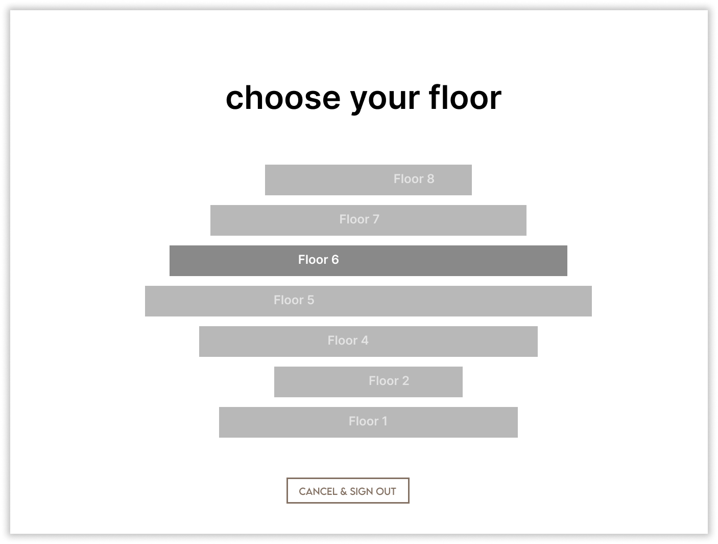
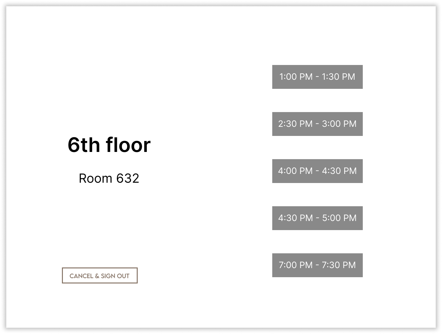
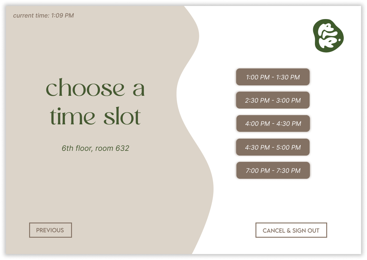
On the other hand, if the user selects to create a new booking, they’ll be first directed to the floor selection page. On this page, floors with no available study rooms will be faded out to prevent false selection by users. Once the user clicks the appropriate floor, they’ll then be prompted to select a specific room and a specific time slot in a similar fashion.
Booking a Room:


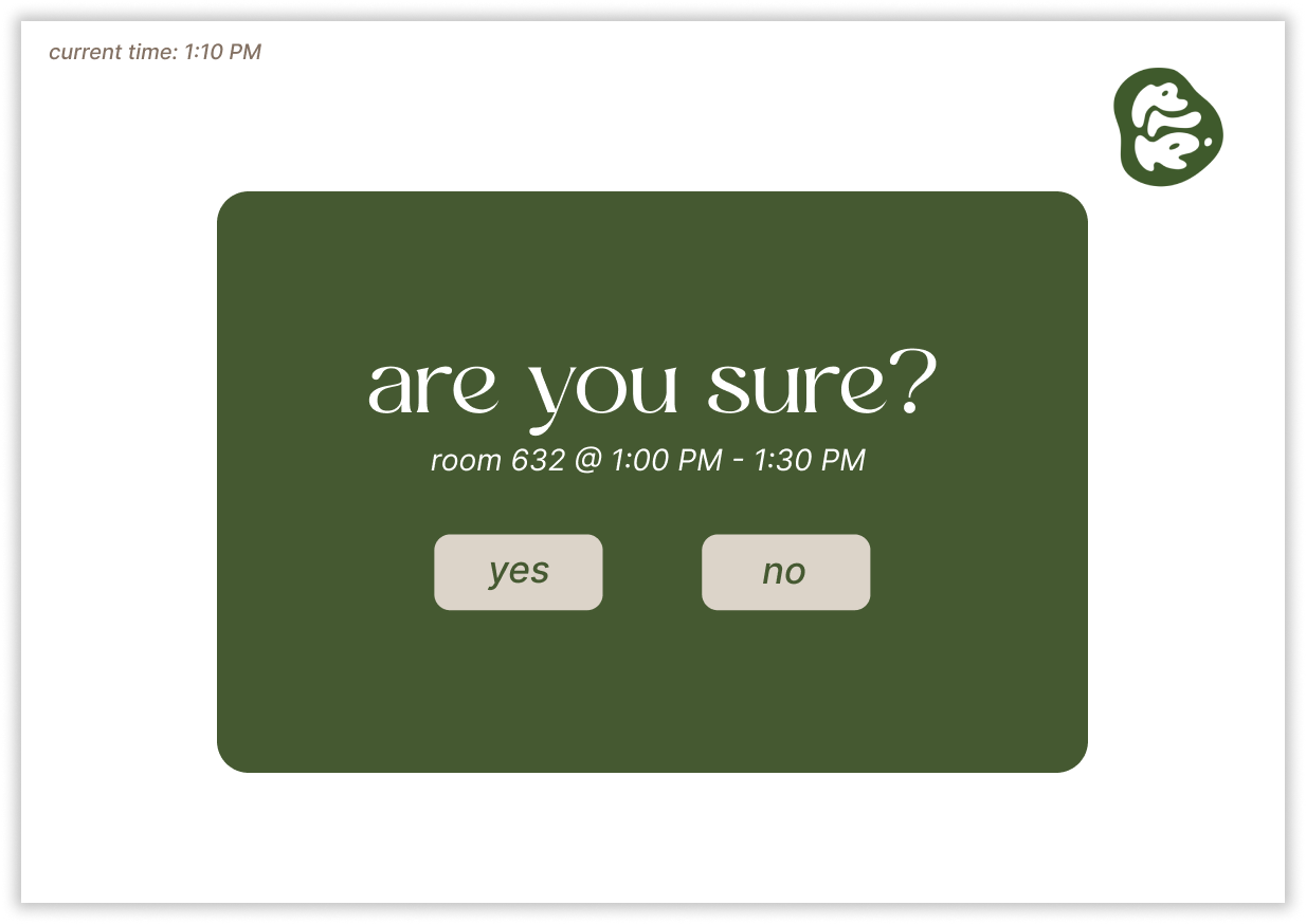
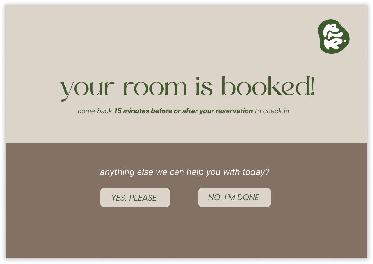
Once again, a confirmation page encourages the user to double check the details of their booking before submitting it. A success page notifies the user that their booking has been successful and once again offers the user the options to extend their session or not.
Booking Confirmation:
My team and I conducted usability testing for our initial hi-fi prototype by giving users the chance to click through the frames while observing areas where they experienced difficulties.
Iteration
Key takeaways from this initial testing that I used to revise the prototype frames :
Spatial Mapping: Users appreciated the layout of the 'choose your floor' screen, which mirrored our library’s design, making navigation intuitive and familiar.
Error Management: Many users encountered issues when selecting rooms or floors, highlighting the need for a back-navigation option to correct past choices.
Clarity of Options: Users expressed confusion differentiating between available and unavailable options, indicating a need for clearer visual cues.
One notable application of this feedback is the addition of pop ups and error messages. Since we noted that users would click on occupied floors that weren’t supposed to be clicked on, I added a visual error message to provide users with that clear feedback.
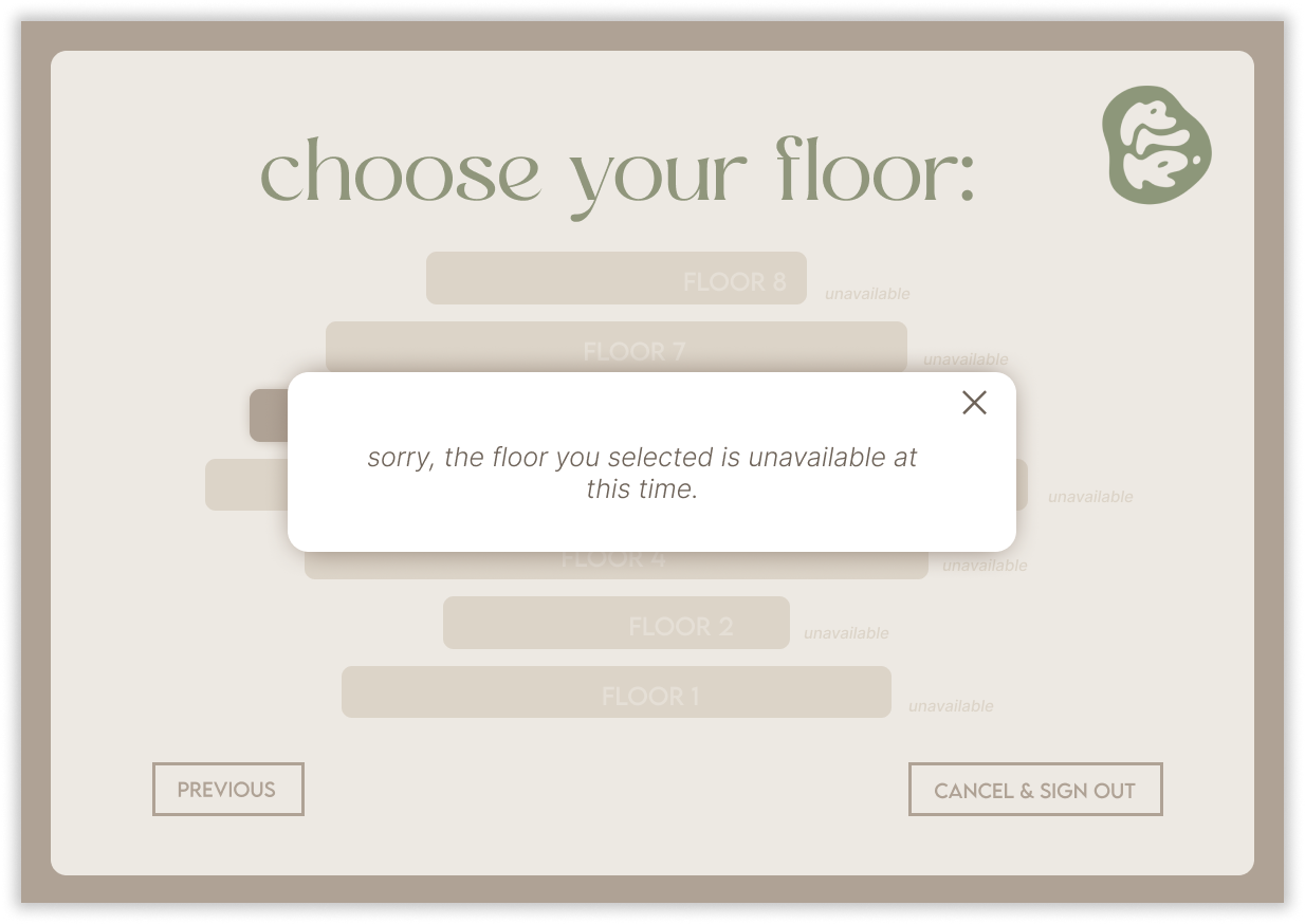
Once the user clicks on one of the unavailable floors, this error message would pop up.
Development
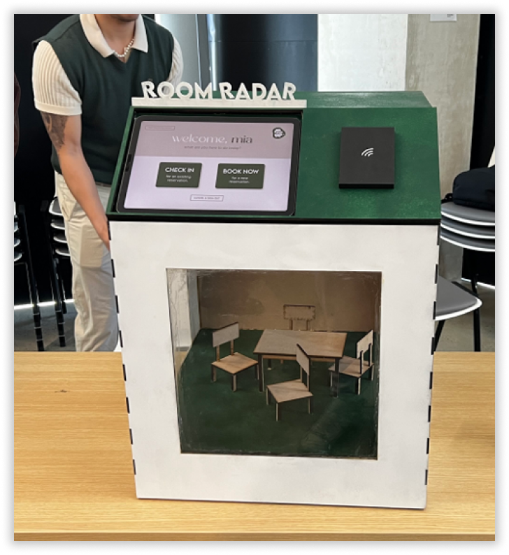

Front and side views of our physical kiosk, as well as a top view of the integration of my digital prototype.
While I took charge of the digital portion of the project, my team focused on the construction of our physical kiosk design, for which I assisted in the initial brainstorming and ideation sessions. The final kiosk design features a dedicated space for a tablet, showcasing my high-fidelity clickable prototype. This integration ensures a seamless interaction between the digital and physical elements, enhancing user engagement and accessibility.
Results & Takeaways
As a result of this project, our team achieved outstanding grades across all evaluation criteria, including a 98 for both the ‘Approachability and flow of user experience’ and ‘Visual Design’ categories.
We showcased our kiosk at the end-of-quarter exhibition, receiving enthusiastic feedback and valuable suggestions for further improvement. I thoroughly enjoyed the end-to-end experience of this project and felt incredibly fortunate to collaborate with talented designers, which enriched our creative process and the final outcome.
Some key takeaways from this experience:
Iteration is key. Some of the features that I am most proud of developing, like the error messages in the prototype, would not have even been found if we had not conducted usability testing after both the lo-fi and hi-fi prototype stages. Learning and observing our prototype in use was key to the improvements that we were able to make.
Communication is difficult, but essential. As a team of 4 who are each individually busy students, it was difficult at first to get everyone on the same page. We quickly learned that we needed to communicate constantly, as it was easy to fall into the rhythm of our own lives and end up going no-contact. Constant updates from everyone were immensely helpful!
Integrating physical & digital design. Since I focused primarily on the digital design for our project, my team worked on the physical kiosk. However we soon realized there was a lot of communication needed to ensure my digital design worked smoothly with the physical kiosk.